
The popular college group chat application get’s a fresh makeover
An intuitive and interactive mobile
experience for college students

GroupMe is a popular group and individual chatting application used mainly by college students to discuss class-related topics. See how it looks now with a much more modern and elegant design made for one-handed comfort.
Project duration: November 2021 - January 2022

Project overview
My role
UX Designer and researcher leading the GroupMe re-design project.
Responsibilities
Conducting user interviews, digital wireframing, low & high fidelity prototyping, conducting usability studies, accounting for accessibility, and iterating on designs.
What is GroupMe?
GroupMe is a free application that allows users to have small to large private chat rooms for their groups. It has multiple features built-in that one would expect from a messaging application including sending photos, videos, sharing locations, liking, muting, and sending direct messages. It is free to download on iOS, Android, and Windows.
Background
I’ve been at the University of Houston since 2018. Throughout my time here, I have taken a crazy amount of classes in two entirely different majors. I first majored in Electrical Engineering and then moved on to Digital Media with a focus in UX/Video Game design. However, despite being two different majors, there was one thing both of them had in common. All the students used a familiar app called GroupMe to communicate with one another.
This is a fantastic app for making small to large-sized groups. It is perfect for sharing photos and videos and having discussions about the class where the professor can’t see you. However, GroupMe has always had a lackluster design. The app looks old and feels sluggish to use, particularly on lower-end devices. The one thing that GroupMe definitely does not account for is bigger smartphones. The bigger the smartphone, the more the user has to reach the top of their screen to perform a certain action. I spent quite some time re-designing GroupMe to be much better for one-handed use. This not only would work brilliantly on smaller devices but also larger ones.
Why is one-handed use so important?
Bigger screens almost always result in the ease of use and reachability suffering.
According to research done by Smashing Magazine,
“49% of users hold their phones with one hand specifically while they are on the go"
What makes an app truly great, is good navigation design. Good navigation helps users discover features faster and find what is important to them.
Apps that have good one-handed use can save the time of users and remove any friction/unnecessary steps that a user might encounter.
One-handed use is becoming more mainstream
Samsung was the first to make their version of Android be focused solely on one-handed use. They did this by simply shifting any clickable elements a user interacts with, to the bottom of the screen.

The Samsung Messages app moved the ‘Conversations’ and ‘Contacts’ buttons down to the very bottom of the screen for easier use. Not only that but all the messages have also been shifted downwards allowing users to easily reach the top message with their thumb.
Research
So, do people currently like the way GroupMe looks and functions? To find answers, I conducted a survey with 50 respondents and interviews with 3 people. The target group was exclusively college students who use GroupMe as their primary way of staying connecting with other students. Here are some of my findings.
Please answer the following question: “I like the way GroupMe looks and functions”
Ease of use should be a top priority
As mentioned before, people are buying bigger smartphones nowadays. App developers need to accommodate for these bigger screens by making their apps easier to use one-handed. Clunky and uncomfortable use of a smartphone can result in the user dropping their device, all in the effort of trying to tap a button placed at the far top left of their huge screen.

Defining the problem
From my user research, I created a problem statement based on the problems and opportunity spaces that came up.
“How can I re-design this app to be easier to use one-handed?”
The problems I have to solve

Ideation
Home page
Taking a lot of inspiration from Samsung’s One UI, I tried to make the home page of GroupMe easier to use one-handed. My goal for this page is to make everything easier to navigate, particularly on bigger devices, and generally improve the design of the UI. I then tested my sketches with users, the majority of which did not like the current design of GroupMe. I then concluded by listing two main things I needed to focus on, based on user research feedback.
Easier navigation
Better designed UI
The solution I came up with

The new design I had planned out for the re-design was solely focused on shifting every command to the bottom of the screen. Every since clickable element had been moved downwards to accommodate for bigger smartphones and people with smaller hands. But to better understand just what had been changed, we need to take a look at what GroupMe looks like in its current form.
Breaking it down
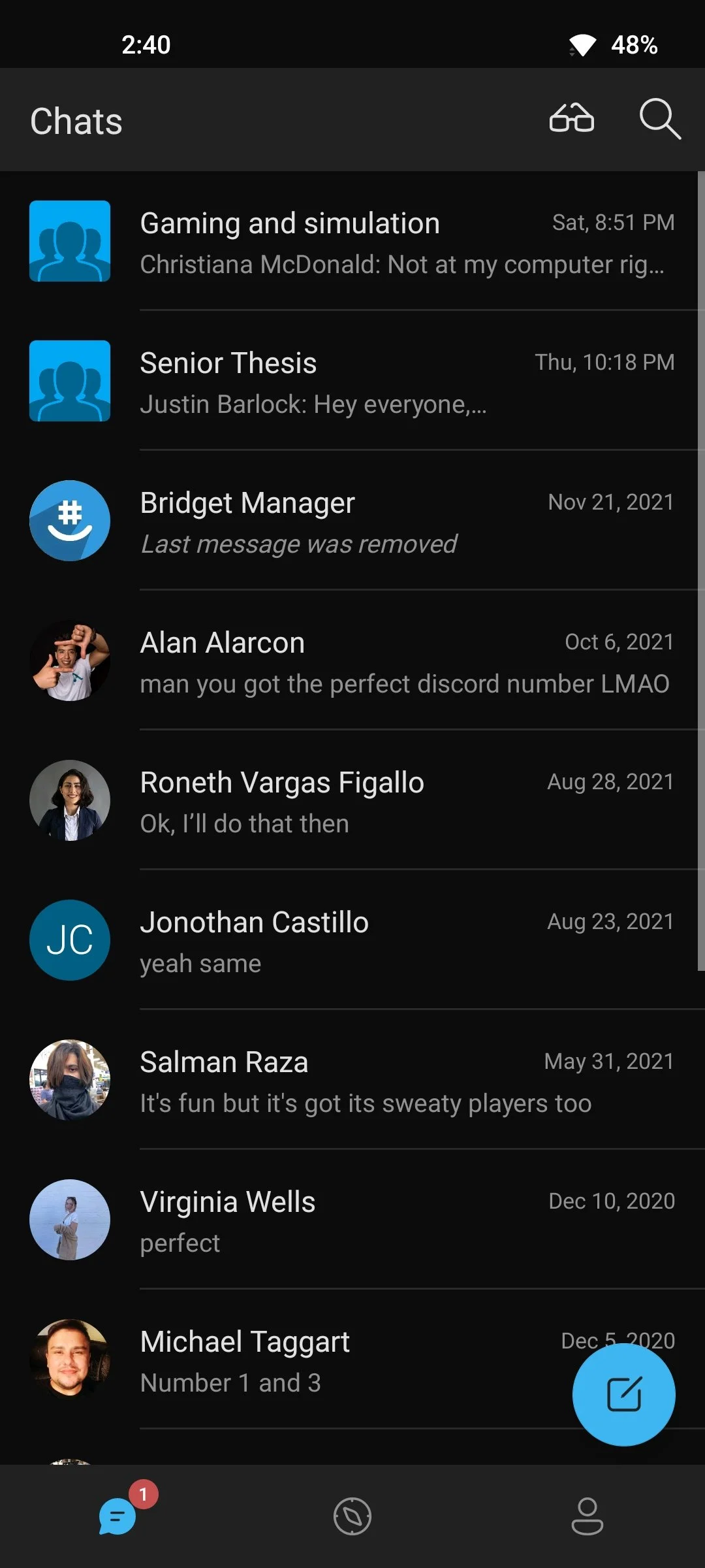
First image
This depicts the main screen of the GroupMe app. The screen that users will see and interact with first.
We can see that the app has already started implementing a one-handed use design by shifting the main navigation elements to the bottom of the screen. However, we can clearly see that the ‘Glasses’ and ‘Search’ icons are still located at the top of the screen.
The ‘Glasses’ icon allows the user to mark all their chats as read, whereas the ‘Search’ icon allows the user to search for specific chats. These are important elements that should be easier to reach.
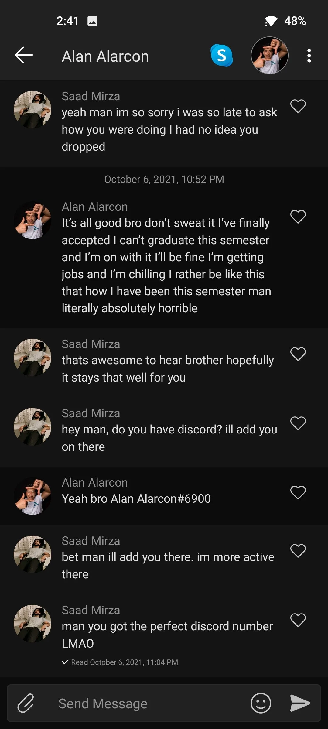
Second image
The main chat page where users will be spending most of their time in the GroupMe app. Main elements like the attachment button, text box, and send are all located at the bottom of the screen.
However, notice the elements that are placed towards the top of the screen. The back button, user profile, skype, and more options. All of these are important elements, yet are placed towards the top of the screen making them much harder to reach. Especially on bigger smartphones. It’s a personal pain point of mine owning a big smartphone and using this app.
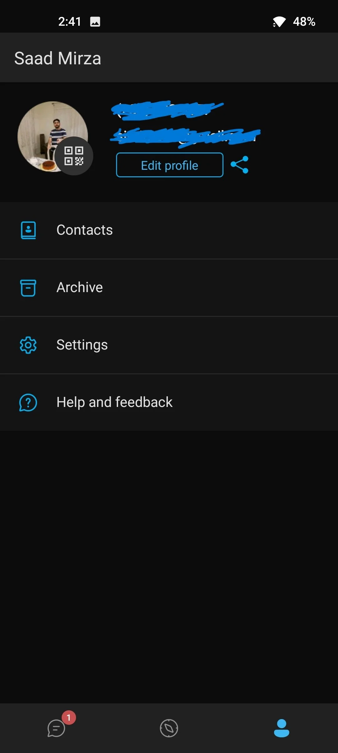
Third image
The user profile page. Once again, we can see that tappable elements are being placed towards the upper half/top of the screen. This makes them more inconvenient and harder to reach. Especially a button like the ‘Edit Profile’. This should be placed towards the bottom of the screen for significantly easier reach.
Making it better
I designed the app from the ground up with the sole intention of every tappable element being shifted towards the lower half/bottom of the screen. Having experienced annoyances personally with the current GroupMe app, as well as interviewing others and obtaining their opinions, I determined this is something that had to be done.

Finalized design

The new logo was implemented on the main splash screen.
A simplified version of the existing GroupMe logo has now been placed onto the splash screen of the app. The background changes depending on what theme the user has their device set to.

An easier to use, and better-looking, home screen. Now with daily reminders.
Chats have now been organized and placed lower, making the top chat easier to access. Important elements, such as the navigation bar and new chat button, have been moved towards the bottom of the screen as well. No clickable elements are present towards the upper half of the screen.
Daily reminders have also been put into place to ensure users stay healthy. These include, but are not limited to:
“Give your eyes a break”
“Drink plenty of water”
“Walk for a short bit”
“Eat something to stay fresh”
Chat rooms have also been given a revision.
Updates to the top banner have been made. Now only the name of the person/group being interacted with is displayed at the top. Group/individual icon is now placed towards the bottom of the screen for easier interaction when wanting to view user/group profiles.

Chat room elements have been given their own space.
Elements including mute, search, gallery, and settings have now been placed in a drawer. These can be accessed by simply swiping up via the small bar. The drawer can be closed by simply swiping down from the bar.

An easier way to go back.
Gone are the days of having to reach to the top left of the screen to hit the back arrow. Simply swipe left from the right side of the screen to be taken back to the previous page.

Newly designed user profile page.
The user profile page now includes banners that can be customized. These banners will then be visible when someone views your profile. Other interactable elements have been shifted towards the lower half of the screen for ease of access.
User feedback

Jamal Elkouka
“Wow dude, this looks great! You moved everything to the bottom of the screen? Sweet! You know it did get kind of annoying with some stuff at the top. Especially that back arrow. The idea of swiping left from the ride edge of the screen to go back is really slick.”

Imaad Uddin
“This is infinitely better. GroupMe’s design was pretty dull-looking. It’s pretty crazy how much more fresh an app looks with a new design. But you didn’t just do that. You also improved the functionality drastically.”

Zain Uddin
“Soo much better man. I got a big phone and if GroupMe ever took this design, or idea at least of making everything one-handed, then using the app would be so much smoother.”
Takeaways
Impact
I was quite pleased to see that people really liked the way my GroupMe redesign came out. I fully believed that by making everything easier for one-handed use, I’d be doing others a favor too. It does not matter if you have a big smartphone or not, easier one-handed use is always a major step in the right direction.
What I learned
There is a lot of us out there with bigger smartphones. We all understand the struggle of using our phones with one hand. Phone in your right hand, something else in your left. It gets pretty annoying, especially when certain elements are placed quite far from your thumb.
By shifting these elements towards the bottom of the screen, I hoped to alleviate some of the struggles that bigger smartphone users encounter.
Thanks for reading!
The time you gave to read through this case study is greatly appreciated. If you would like to get in touch with me, then please contact me through my LinkedIn or through the contact form found on my ‘About’ page. Addtionally, you can reach out to me through my email as well.
Email: simirza98@gmail.com