
Google weather meet's Google’s living universe wallpapers
A fun and immersive weather experience
through Google Earth


The freshly updated Google Weather app shows off a new and stunning design whilst also incorporating Google’s own living universe wallpapers to show the current location.
Project duration: July 2021 - October 2021
Project overview
My role
UX designer and researcher leading the Google Weather app redesign project.
Responsibilities
Conducting user interviews, digital wireframing, low & high fidelity prototyping, conducting usability studies, accounting for accessibility, and iterating on designs.
What is Google’s Living Universe?
The Living Universe is a collection of wallpapers that feature high-fidelity imagery from Google Earth. These are visualizations from weather data and user interactions specifically and exclusively optimized for the Google Pixel series of smartphones.
They were first introduced with the Google Pixel 2 series of phones and were a key feature when they launched. They have since been present in newer models of Google Pixel phones.

Marvelous Marble
Google’s Marvelous Marble wallpaper showcases views of the Earth from space based on your GPS location. It updates itself with a time of day shifts, real-time clouds, and lighting storms data from Weather.com.

Schwyz
Dynamic wallpapers were created based on locations around the world. Each location has a neat animation upon unlocking the phone, with swipe interactions revealing more of the scene through camera movements and parallax. Artificial elements such as clouds, cards, birds, and crashing waves are used in a variety of different wallpapers from the Living Universe collection. These elements give the wallpapers a burst of life.
Why was this project done?
The Problem
It’s a weather application. Its sole purpose is to allow users to see the conditions, temperature, and other metrics of your smartphone/tablet’s current location. And it does that really well. I have, by no means, found any issues regarding the accuracy of the metrics on this app.
However, there is one glaring issue that Google has not addressed. You see, something that other competitors have done with each device update is make changes to their weather apps. These changes come in the form of better accuracy and location detection. However, competitors also implement minor to major design changes.

OnePlus Weather
You can see how OnePlus has changed its weather app during the transition from Android 10 > Android 11.
Good design is important
As you can see, the visual and hierarchy differences are pretty substantial. The left is the older OnePlus weather app and the right is their newly updated app. This goes to show you that the company cares about its smaller apps, even though people do not spend a majority of their time on them. It is a weather app after all. We just open it up, check our weather and other details, and then we close it.
But, a visually stunning design can make you want to explore more. People enjoy beautiful things, color combinations, and good-looking typography. Users build their first impression based on visual elements.
Now let me preface this by saying, Google has done an outstanding job with their latest Android 12 update. The new Material You theming is phenomenal and the newly updated apps all look and feel fantastic. However, they still neglected their weather app. Let me show you the difference between the Google Weather app from Android 9 and the newly released Android 12.

Google Weather App
Android 9 on the left, Android 12 on the right. Pretty much the exact same design.
See my point? They look identical. Now don’t get me wrong. The app does a lot of things well. It’s simple to read and understand and has absolutely nothing offensive about its layout or design. However, it’s boring.
The art of the frog is neat, but you can’t help but wonder Google could have done something a little more interactive for the background. They are a gigantic company that is heavily involved and focused on Artificial Intelligence. They can easily utilize those elements into their more of their apps.
The Goal
While it may seem obvious what I’m trying to achieve with this project, let me write it out in full for better understanding. To give the existing Google weather app a completely new design as well as a distinguishable feature that sets it apart from every other weather application out there.
As time goes on, people are on their smartphones more often. Though the usage varies from app to app, the weather app is an incredibly important application on a smartphone.
Weather forecasting has come a very long way in better informing smartphone users about current and future weather conditions. In this post-COVID world, people care far more about their health. Weather providers are increasingly expected to function as a news or alert system for any environmental event that is likely to affect an individual at their current location. Even affecting them at a location they will be at, at a given time.
As environmental reporting methods have improved and will continue to improve, there has been an increased emphasis on the impact of environmental exposure on a person’s wellbeing.
The interplay between environmental factors is also becoming important. A weather app is not being very useful if it reports a sunny and dry day but does not take into account the poor air quality.
Weather applications are now expected to provide a more complete picture. Features such as air quality reporting, pollen level, and wildfire alerts now feature on weather apps that can be found on the App or Google Play Store but are not built into the Google Weather app.
The Google Weather app does inform you of events like hurricanes, wildfires, and other alarming weather events. However, it does not inform you of other features such as pollen count or a real-time air quality monitor.

Missing something?
Details shown are fine but are missing a few important elements. For example, where is the air-quality index or the pollen count?
Summary of user research
I started off this project by conducting interviews with Android users. I did not restrict myself to a certain device or specific brand of smartphone or tablet, but rather everyone I could possibly find. I managed to gather a pool of 50 different users using a variety of smartphones from a lot of different brands. Below you can see a breakdown of all the devices each of these 50 users were using at the time of the interview.
So the Galaxy series of devices are the most popular. This should come to no one as a surprising result given just how popular these devices are. After the devices used were recorded, I then began the interview and asked all the participants what weather application they use.
Now, since Samsung devices come shipped with Samsung’s own idea of Android called One UI, I asked the Samsung users whether they used the default Samsung Weather app, the Google Weather app, or third-party weather app from the app store.
For Google Pixel owners it was essentially the same test but between the Google Weather app or a third-party application from the Play Store.

An affinity diagram was created to write down exactly what needed to be done on my end. I broke the diagram down into three categories. Features, design, and functionality. The features tab describes exactly what sort of implementations people want within the app. The Design tab simply points out how I can improve the design for the end-user. The functionality tab ensures that despite the additional features, users’ devices won’t slow down and that smoother animations be put into place. The newly designed weather app should not also be exclusive to the Pixel series of smartphones.
Identifying user irritations
Lack of information
The Google Weather application simply does not provide an ideal amount of information. The main information pieces that users seemed to have wanted the most were pollen count and air-quality monitoring. In my design of the Google Weather app I have included both of those, as well as some other smaller details.
Boring design
A surprising amount of the users that I interviewed also stated their opinions on how the design of the Google Weather application was lackluster and uninspiring. Though it does not seem like a big deal, people spend a good amount of time on their weather applications looking at information about the current or upcoming days.
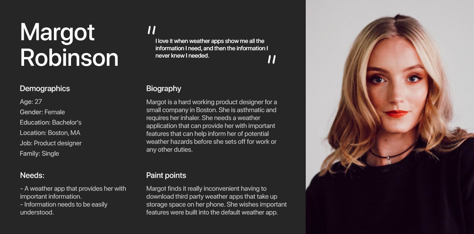
User persona
So, then
Here’s the new Google Weather application.
Let's start by comparing the main interface. The screen seen the moment the app is opened:

The left image shows the low-fidelity wireframe that I made prior to making the final iteration of the weather app. The point of this redesign was to be easy to read and understand without having a lot of elements on the screen. Only the important aspects, such as current low/high and location were included to be on the home screen. Tapping the location would allow the user to change the location.
Other elements such as an icon and text describing the current weather are featured at the top of the screen. The time is also included at the bottom of the screen. The weather is now displayed directly in front of the user in the form of big bold text. The background is the main star of this redesign. It is now fully utilizing Google’s Living Universe wallpapers directly ported from Google Earth to show the location in real-time.
Let’s take a look at the rest of the weather app where your details are

Over here we can see how I designed the rest of the weather app. This is the screen that is accessed by simply swiping down from the main weather screen. The main weather screen nicely fades away into the screen you are seeing on top. In the original Google Weather app, the details section was shown through text alone.
I tried to make this section look more visually appealing by putting icons next to the text. This not only makes it better to look at but also makes finding information easier. Additionally, there is more information available here now. The details now provide the user with the current direction the device is facing, wind speed, cloud cover, sunset, and sunrise.
The Hourly section has remained relatively unchanged as it did not have any blatant design flaws in the original Google Weather app.
Adding an Air-Quality Index

Scrolling down further provides the user with even more information.
The wind section of the weather app also remains relatively unchanged from the original. The only changes I have made here include removing the direction icons on top of the bars from the original. They have now been replaced with the predicted wind speed at that certain time.
The precipitation section is also unchanged from the original weather app due to it not having anything wrong in the first place.
Where we do see a new addition is the Air-Quality index section. This is a feature that a lot of users have wanted as it provides the user with information on how polluted the air currently is or how polluted it will be in the future. This is an important feature that should have been included in the original Google Weather application. It provides people with vital information about the conditions of the air in their current location and how the quality of the air can impact their health.
“Air pollution is one of the primary causes of health ailments and premature death in the world. The World Health Organization estimated that ambient outdoor air pollution kills around three (3), million people, every year. The most common air pollutants found outdoors include what the EPA categorizes as criteria air pollutants. These criteria air pollutants are ground-level ozone, particulate matter, lead, carbon monoxide, nitrogen dioxide, and sulfur dioxide.
Both sulfur dioxide and nitrogen dioxide are emitted by industrial facilities and cars. They can exacerbate respiratory ailments like asthma, and are thought to be contributors to asthma and air pollution-related visits to the emergency room. High levels of exposure can reduce lung function permanently.
Carbon monoxide is released into the air primarily by the incomplete combustion of fossil fuels. Carbon monoxide is colorless and odorless, and when inhaled in large amounts it can easily lead to confusion, dizziness, and death.
Though levels of atmospheric lead have decreased by around 98% since 1980, lead can still be found in the atmosphere, and exposure to it can cause a variety of problems. Lead can impact kidney function, the entire nervous system, the immune system, and lead to developmental problems in children.” - Camfil, 2018
How an air quality index works
An air quality index works by assigning the air in a given area one of six different rankings. This depends on the level of atmospheric air pollutants present in the area’s air. Air quality rankings usually range from Good air quality to Hazardous air quality. Each ranking has a corresponding number value as well as a color.
Let’s go through all the ranks
The first ranking in the air quality index represents Good air quality. This is represented by the color green. This typically ranges between the value of 0 to 50. This ranking poses little to no threat to the health of the general population.
The second-ranking of the air quality index shows acceptable or moderate air quality. This section is represented by the color yellow. This ranges between the values of 51 - 100 and means the air is generally safe. However, those are who are sensitive to air pollution should be cautious as they may experience respiratory symptoms.
The third-ranking shows that the air quality is “unhealthy for sensitive groups” and is represented by the color orange. The values range from 101 - 150 and it means the general public is not likely to be negatively affected by the air. Sensitive groups like older adults and children are at risk from exposure to particles that may be present in the air.
The fourth-ranking is where it starts getting pretty bad. You can tell because this section is shown with the color Red. This means that the air is generally unhealthy. The values range from 151 - 200 and at this level, the air can start having adverse health effects on the entire population. This also results in sensitive groups having more serious effects.
The fifth ranking is denoted by the color purple and shows that the air quality is Very Unhealthy. The values here range from 201 - 300 and means that the entire population can have severe health impacts.
The sixth and final ranking of the air quality index is shown by the color maroon. The values range from 301 - 500 and means that the air is hazardous. At this level, an emergency alert would be broadcast about the horrible conditions. The entire population will be affected by this poor air quality and immediate steps should be taken to protect oneself from the air as it can lead to even more serious health problems.
Data regarding all rankings of the air quality index was found through Camfil. “Why Understanding The Air Quality Index Is So Important For Your Health”. February 14, 2018
As we can clearly see, air quality monitoring is extremely important. This is a feature that every weather application should implement. I found it incredibly surprising that the Google Weather application does not feature an air-quality monitoring section. Now, to give the Google Weather app some brownie points, it does report when weather conditions are poor.
However, it does not take into account when the air quality is getting worse. It simply does not have any air-quality monitoring built into its app.
With the redesign, not only does the application now have an air quality index section, but it also prompts the user whenever the air quality index falls above the 100 mark.
Low-fidelity prototype example

Finalized design

Weekly section can also be expanded

Users can tap on each weekly element to show more content. By tapping on a weekly element users are presented with the hourly weather data for that day as well as the sunrise/sunset.
You can rearrange items

On the left image, you can see what the default settings look like. The right image shows that the user can now re-arrange items to their liking. In this case, the user has flipped Hourly and Wind so that Wind is now at the top of the list right underneath the additional details. Users can also choose to hide/show elements as well. As you can see Sun/Moon are currently hidden.

And now the weather app updates itself to whatever the user sets. Wind is now placed on top of Hourly.
User feedback
“I absolutely love the uniqueness of this weather app. I’ve never really seen anything like it. But then again, I haven’t used many other third-party weather applications. Regardless, this looks fantastic! I loaded up the image on my phone to see what I’d look like on a phone in reality, and it’s stunning! Great work!” - Julian Castro (Galaxy S8+ user)
“Wow, this has to be the most unique weather application I’ve seen. Normally they all just have some animation of rain or snow or whatever in the background depicting what’s happening. But I’ve never seen one that uses a real-time background of my location depicting the weather. That is super neat. It’s so simple too because Google has these wallpapers as you’ve told me. They should really use them in their weather app!” - Madeline Clark (Galaxy Note 9 user)
“This looks really great! I think it’d be super neat if Google were to actually implement something like this. The weather app having a moving real-time background of my current location? Yes! That’s awesome! I really want this on my phone right now. I didn’t know I needed this until now!” - Marium Qadri (Google Pixel 4 XL user)
“It’s just a weather app. I never really paid much attention to it, as I thought you couldn’t really make something like that interesting. But this caught me completely off guard. A living background of my location? Yeah, that would have me staring for a good bit of time haha. That is something I didn’t even think of. Nor have I seen something like that before.” - Pablo Pardo (Galaxy S9+ user)
Takeaways
Impact
My redesign of the Google Weather applications certainly caught the eyes of everyone that looked at it. Everyone who was given access to see the redesign was immediately struck by the drastic main page screen.
Everyone seemed to also love the fact the weather was now right in the middle as big bold text, saying it gave the app a more “Google” or “minimalistic" feel.
What I learned
This project was certainly an interesting experience. Having been my first case study on my own project, I had a blast. The interview part of this project was probably my favorite as it was interesting to see the different types of devices people used and what kind of weather apps were their preferences.
I learned that there are quite a lot of people that want an air-quality index and a lot of people that value interesting and new designs. It is important to always throw in features that people want in order for them to continue using your application. By neglecting what people want, they’ll just end up leaving and finding an alternate solution.
Next steps
More features
There are still more features that I would have liked to include in this project. Things that I will certainly be adding in my spare time as well as testing out new designs. There are countless amount of weather app providers on the Play Store/App Store that possess features and design elements that I can work off to only improve what I have right now.
Good design isn’t just completely thought up by yourself. You need to take inspiration from others and turn whatever they have into something better by using your own unique ideas.
Let’s connect!
Thank you for taking the time to read through this project’s case study. It took some time to research, conduct, and write down so I hope it was worth your time!
If you would like to get in touch with me then please do so either through my LinkedIn or my email. Additionally, you can contact me through the contact form found on the ‘About’ page. To see more of my work, please click the ‘Projects’ button on the navigation bar.
Email: simirza98@gmail.com